线性渐变
向下/向上/向左/向右/对角/其他方向。
上下、左右、对角
1 | background: -webkit-linear-gradient( direction, color1, color2, ...); |
direction:
- 默认:从上到下。
- left:从左到右。
- right:从右到左。
- bottom right:从右下角到左上角。
- bottom left:从左下角到右上角。
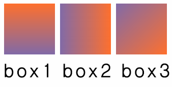
box1渐变为从上到下,box2为从右到左,box3为从右下到左上。1
2
3
4
5<body>
<div class="box1"></div>
<div class="box2"></div>
<div class="box3"></div>
</body>
1 | .box1, |
角度
1 | background: -webkit-linear-gradient( angle, color1, color2,...); |
angle:
- 0deg:从下到上。
- 180deg:从上到下。
- 90deg:从右到左。
- -90deg:从左到右。
box1渐变为从上到下,box2为从右到左,box3为从右下到左上。1
2
3
4
5<body>
<div class="box1"></div>
<div class="box2"></div>
<div class="box3"></div>
</body>
1 | .box1, |
重复的线性渐变
1 | background: -webkit-repeating-linear-gradient( color1, color2, ... percent); |
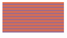
每个条带占10%,即重复10次。1
2
3<body>
<div class="box"></div>
</body>
1 | .box { |
css径向渐变
由中心向四周渐变。1
2
3
4background: -webkit-radial-gradient( center, shape size, start-color, ..., last-color);
background: -o-radial-gradient( center, shape size, start-color, ..., last-color);
background: -moz-radial-gradient( center, shape size, start-color, ..., last-color);
background: radial-gradient( center, shape size, start-color, ..., last-color);
center
center 属性规定渐变中心点。值为at x y(x,y可以用px或者%表示位置, 默认为图形中心)。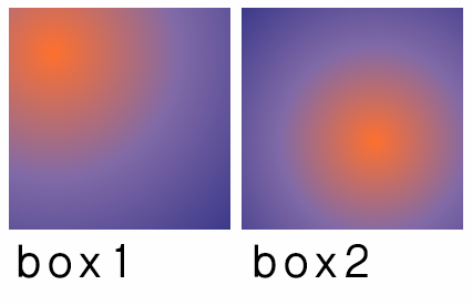
box1的渐变中心在(40px,40px),box2的渐变中心在(60%,60%)。1
2
3
4<body>
<div class="box1"></div> ‘
<div class="box2"></div>
</body>
1 | .box1, |
shape
shape 属性规定渐变形状。值可取:circle(圆形)、ellipse(椭圆形) 。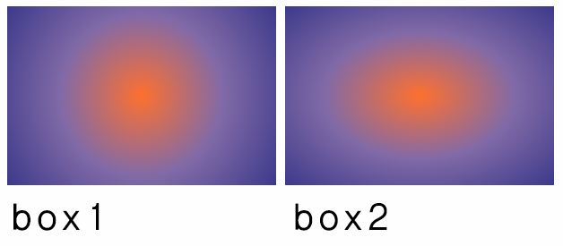
box1渐变形状为圆形,box2渐变形状为椭圆。1
2
3
4<body>
<div class="box1"></div> ‘
<div class="box2"></div>
</body>
1 | .box1, |
size
size 规定渐变大小:
- closest-side:渐变中心距离容器最近的边作为终止位置。
- closest-corner:渐变中心距离容器最近的角作为终止位置。
- farthest-side:渐变中心距离容器最远的边作为终止位置。
- farthest-corner:渐变中心距离容器最远的角作为终止位置。
重复的径向渐变
1 | background: -webkit-repeating-radial-gradient( color1, color2, ..., percent); |
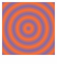
每个条带占20%,即重复5次。1
2
3<body>
<div class="box1"></div>
</body>
1 | .box1 { |
边框渐变
1 | border:width solid; |
- width:即为边框宽度 必须设置单位。
- slice:偏移量 可以设定四个值,无单位。
如果缺少border:width solid则border-image无法被浏览器识别
如果slice值加了单位 则border-image无法被浏览器识别
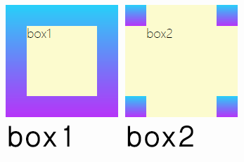 box1设置偏移量,box2未设置偏移量
1
2
3
4<body>
<div class="box1"></div>
<div class="box2"></div>
</body>
1 | .box1, |